Improving the User Experience significantly
How I spearheaded the redesign of Betalingsservice’s website, improving the Customer Empowered Business Score (CEB) by 55%.
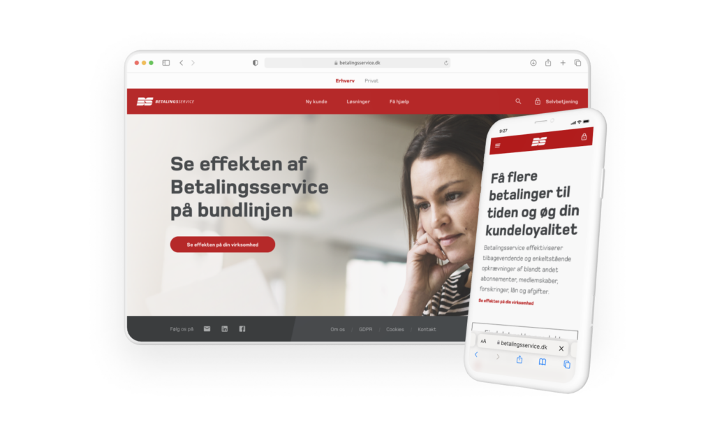
Quick Summary
A 55% Increase in Usability & Self-Service Efficiency
After a complete UX/UI overhaul, we transformed Betalingsservice.dk from a complex and confusing platform into a user-friendly and structured digital experience.
CEB Score increased from 38% to 59% – a 55% improvement in ease of use.
Reduction in customer service inquiries as users could now self-serve effectively.
Faster onboarding for new customers, leading to better retention and fewer drop-offs.
But how did we achieve this transformation?
Let’s dive in.
Role
UI/UX Designer
Tools
Sketch, Illustrator, InVision, InDesign, 3ds Max
Team
Marketing Manager, Customer Service, Service Designer
Timeline
Oct 2018 – Jan 2019
(4 months)
The Challenge
A Confusing, Hard-to-Navigate Website
Before the redesign, 96% of users struggled to find what they needed on Betalingsservice.dk.
❌
High customer support inquiries
Users couldn’t complete simple tasks on their own.
❌
Disjointed navigation
Broken links, unclear menu structures, and multiple login portals.
❌
Poor onboarding experience
New customers struggled to register correctly.
The Goal
To redesign the website, making it intuitive, structured, and efficient for both new and existing customers.
Research & Design Sprint
Overhauling Navigation & Information Architecture
UX/UI Redesign of Key Pages
Implementation & Developer Collaboration
Phase 1
Research & Design Sprint
As a core contributor in a five-day design sprint, I helped:
- Conduct expert interviews with key stakeholders (customer service, sales, and account managers).
- Identify user pain points and define a clear focus area for the redesign.
- Establish a 5-year vision for improving usability and self-service capabilities.
- Explore and prototype solutions, testing them with real customers.
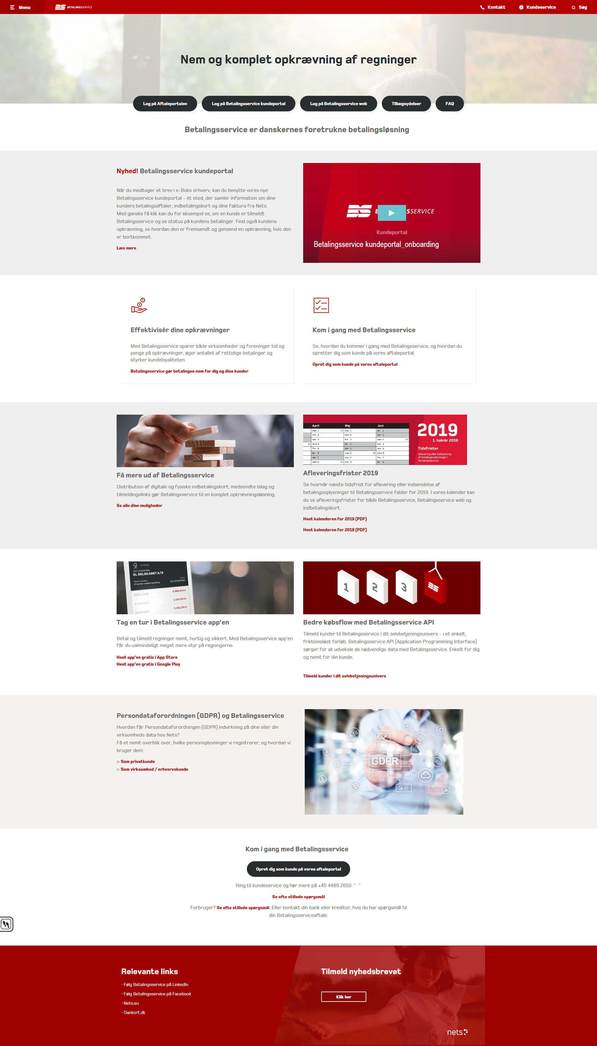
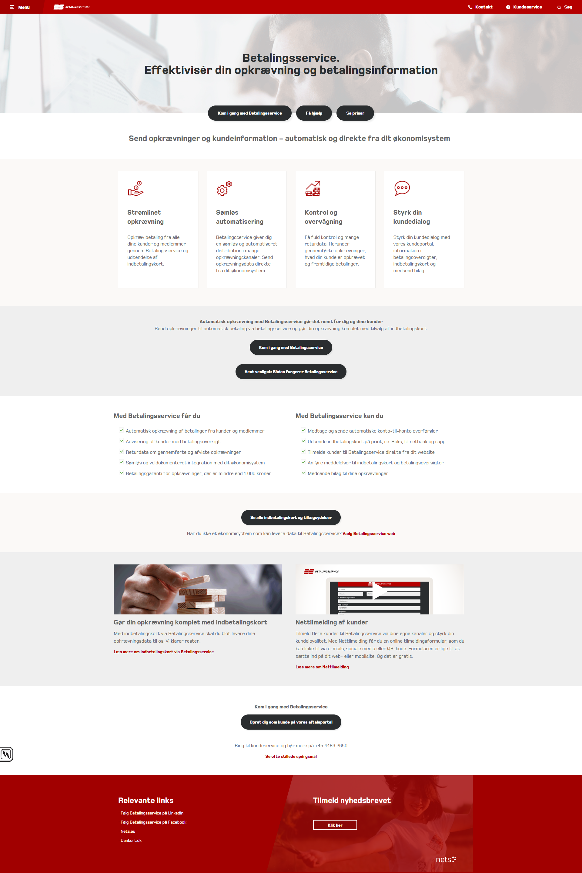
Key Insights from Research
💡
Users couldn’t find key actions, like updating payment details or registering.
💡
Navigation was overly complex, with too many steps to reach important pages.
💡
The self-service experience was inadequate, leading users to depend heavily on customer support.
Phase 2
Overhauling Navigation & Information Architecture
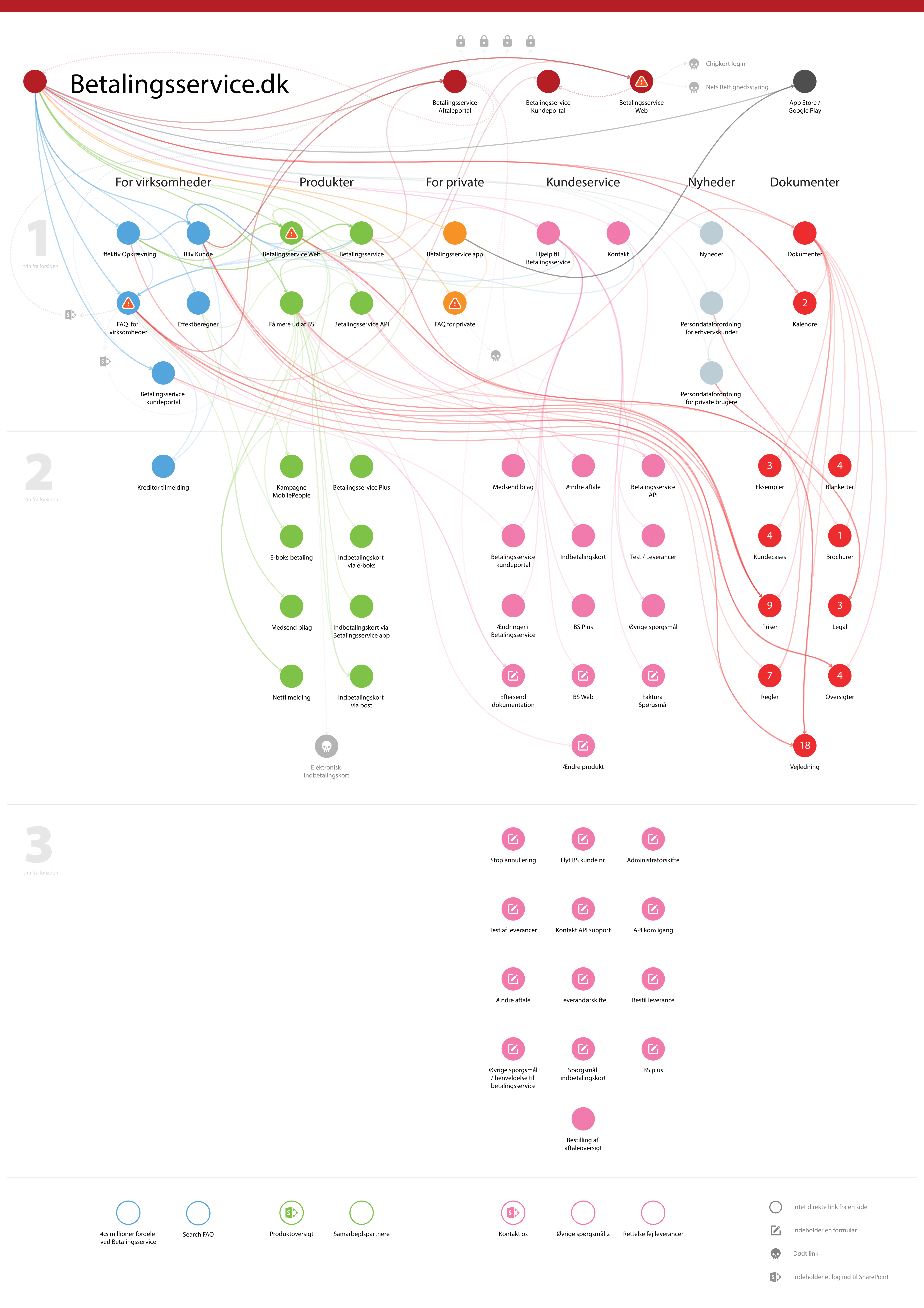
One of the biggest UX challenges was the fragmented navigation, which created confusion and inefficiency.
The Problems We Identified
🔴
Multiple broken and inaccessible links.
🔴
Too many steps to complete simple actions.
🔴
Multiple login portals with no clear distinction.
Our Solution
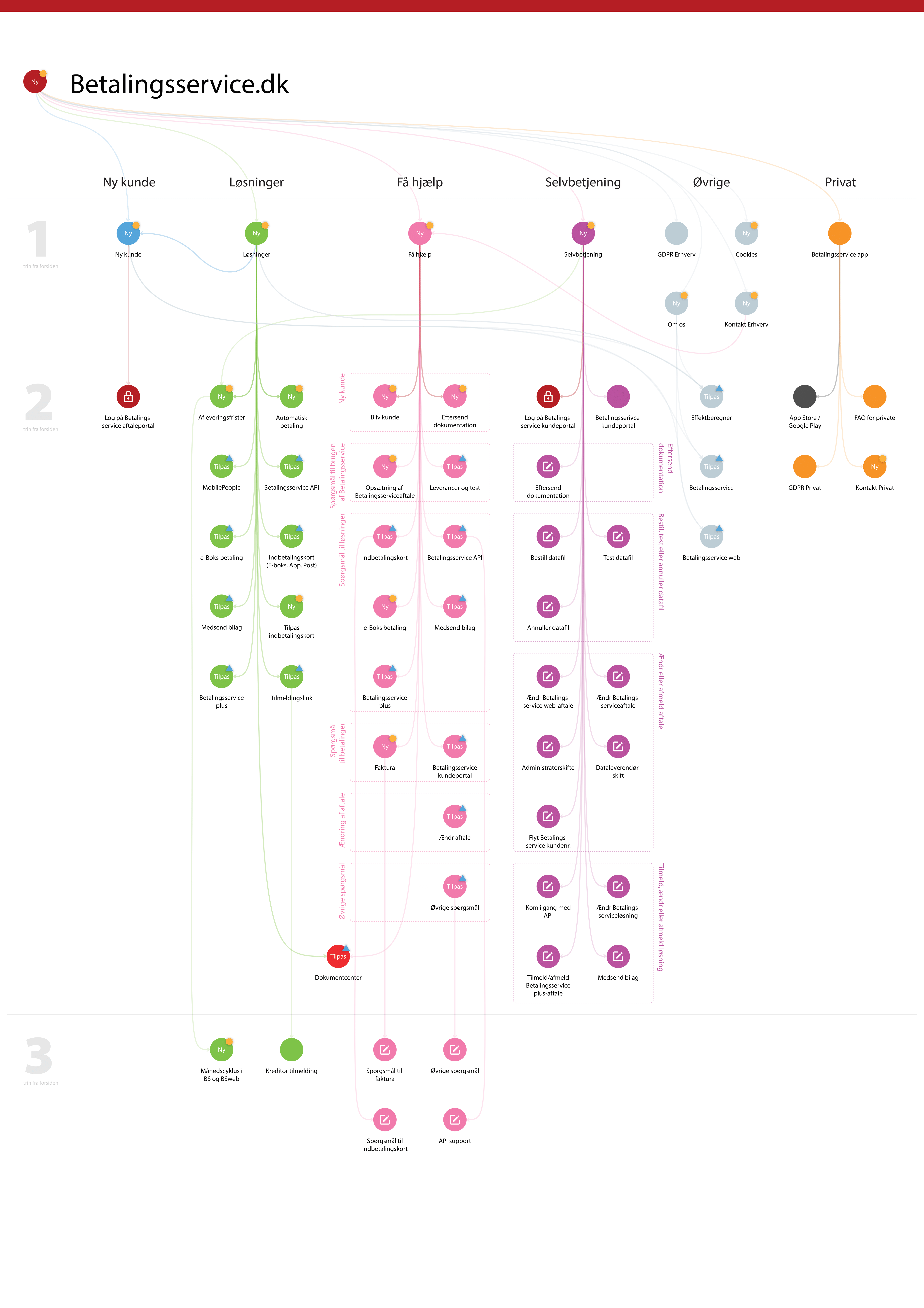
- Mapped out the old navigation, revealing inefficiencies.
- Designed a simplified, intuitive navigation structure.
- Unified all self-service features under a single “Self-Service” page.
- Created a visual comparison of old vs. new navigation for stakeholder buy-in.
Phase 3
UX/UI Redesign of Key Pages
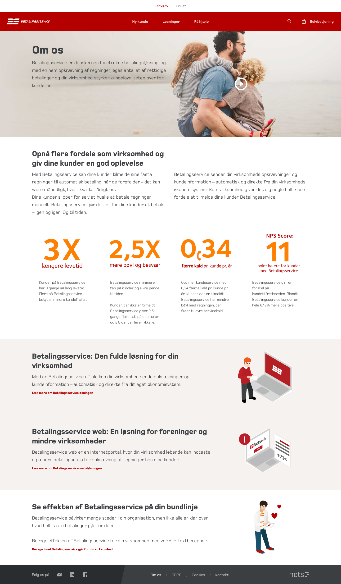
I was responsible for designing and optimizing several critical pages, which were later validated by an external research agency.
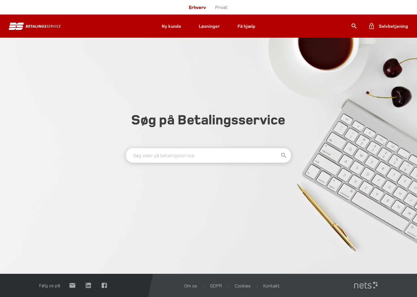
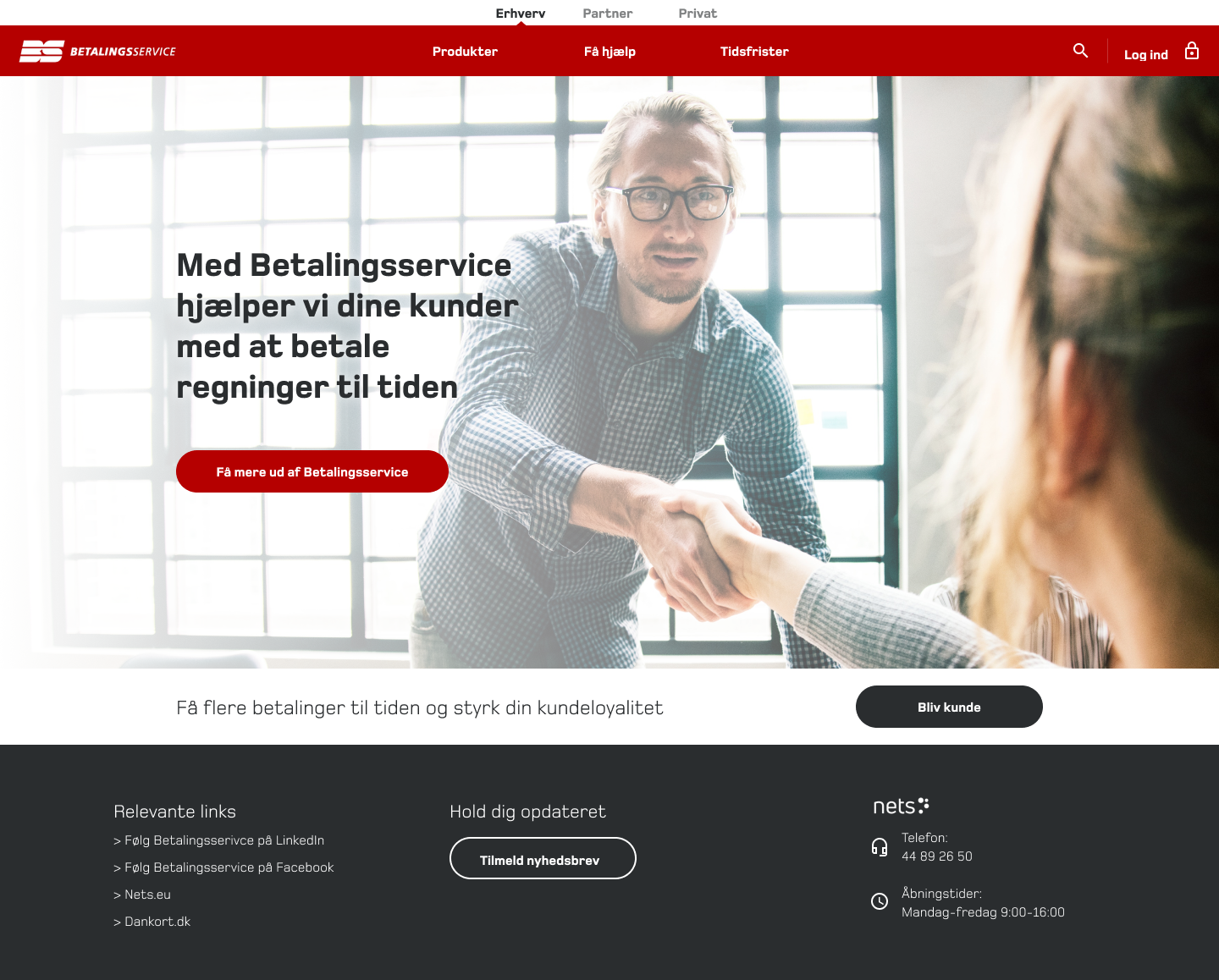
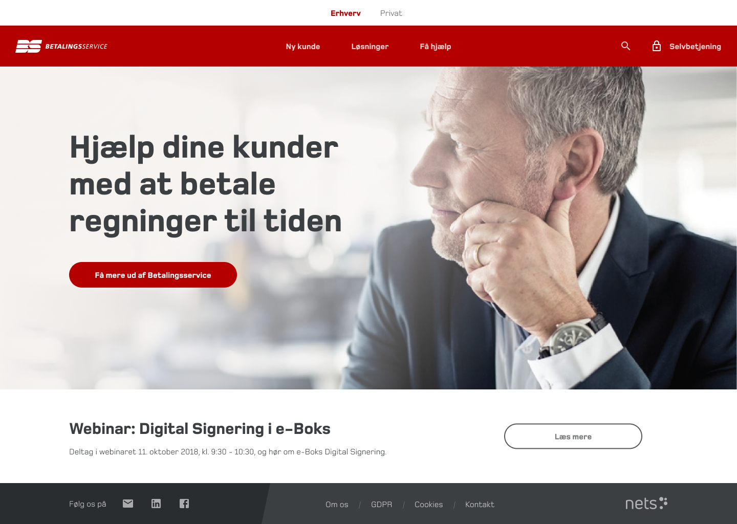
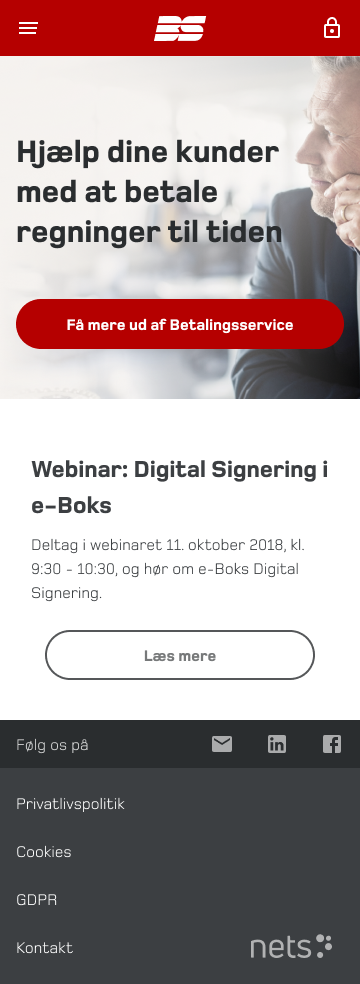
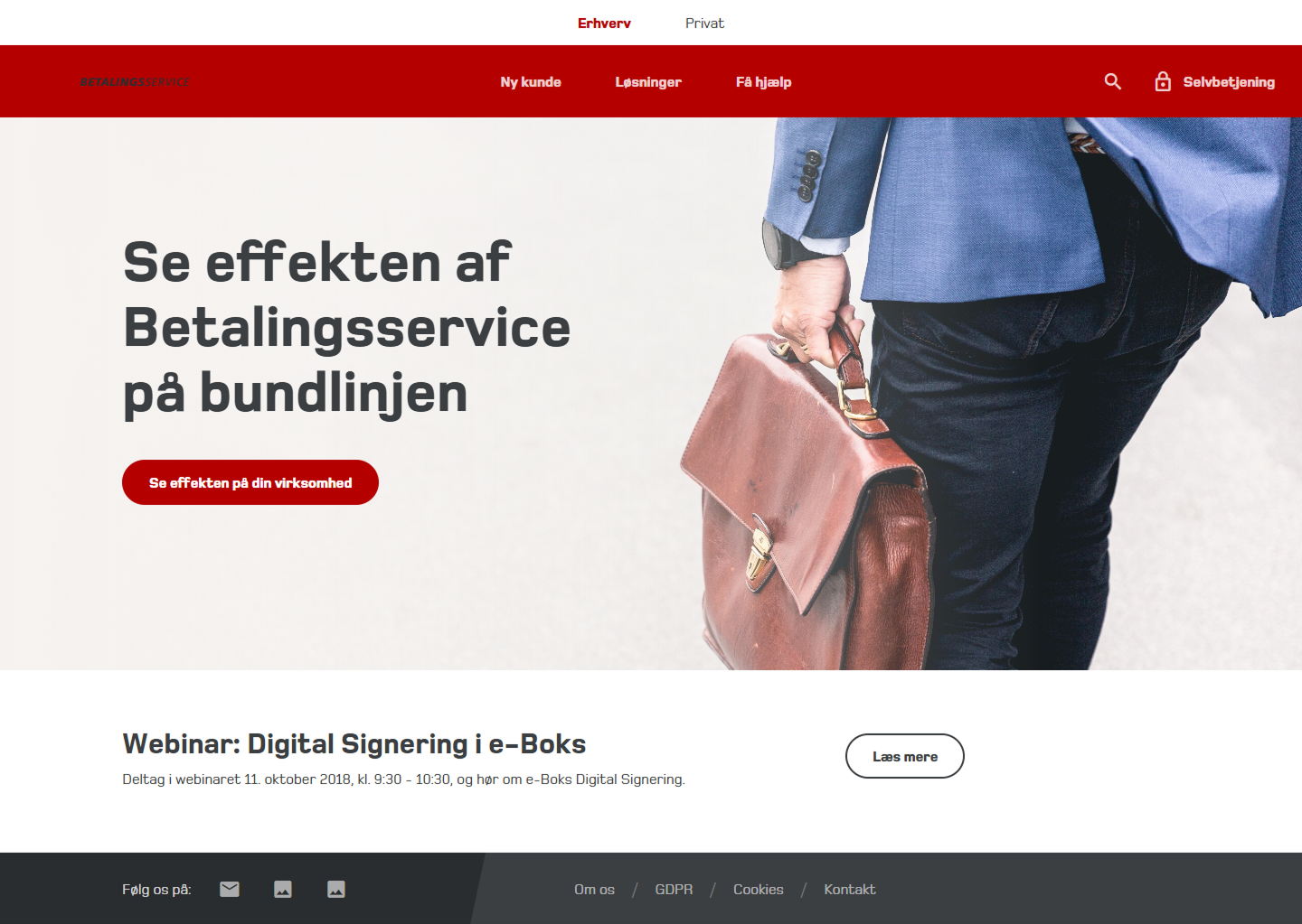
Homepage Redesign
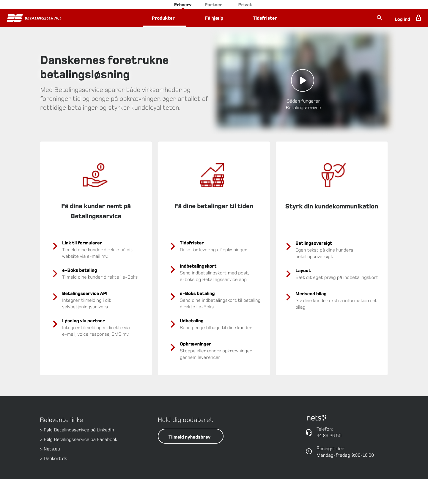
- Simplified the layout with more whitespace and clearer Call To Actions.
- Navigation bar restructured for better usability.
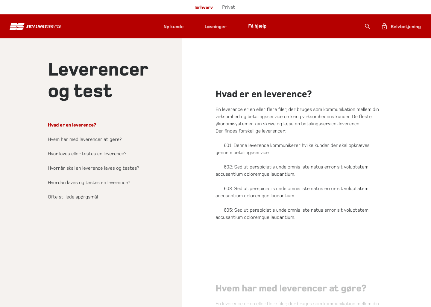
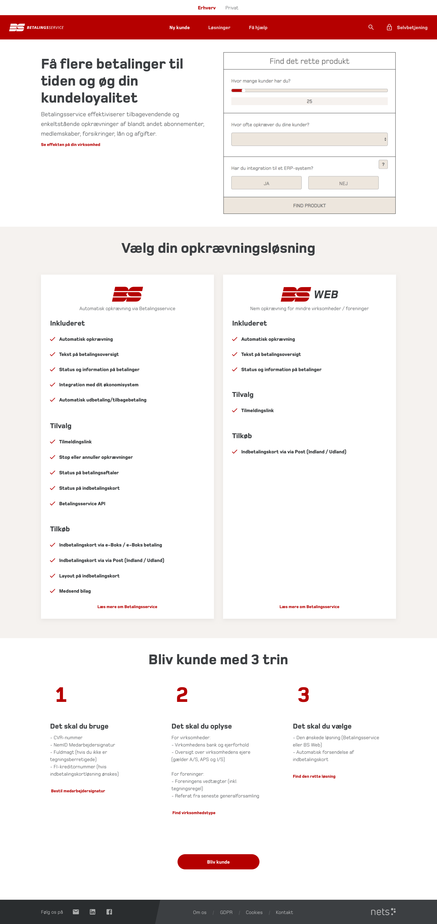
“New Customer” Page
- Moved the product selection calculator to the top, making it instantly accessible.
- Step-by-step onboarding guide, reducing drop-offs.
- Large Call To Action button to start onboarding seamlessly.

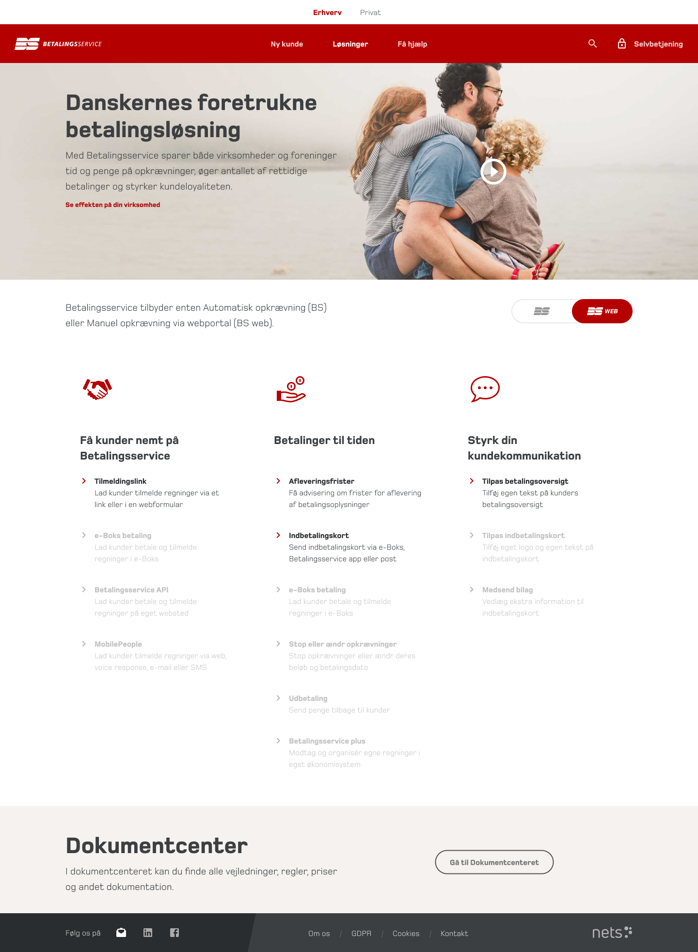
“Solutions” Page
- Grouped all features into three categories: Services, Add-ons, and Purchases.
- Introduced a toggle switch, allowing users to filter between Betalingsservice and Betalingsservice Web, with unavailable features grayed out.

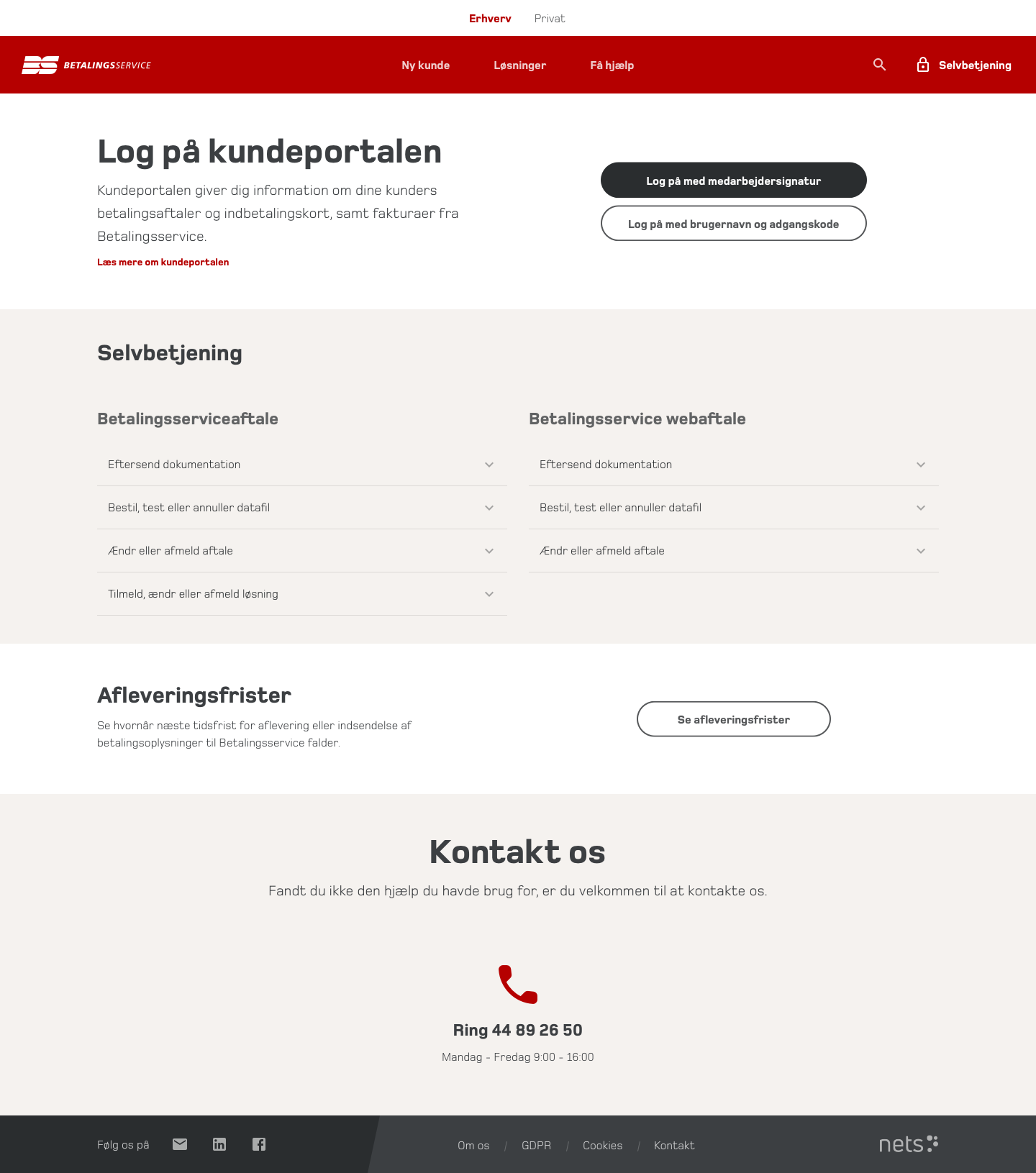
“Self-Service” Page
- Merged customer portals and forms into a single location.
- Structured all actions into two main categories, reducing confusion.

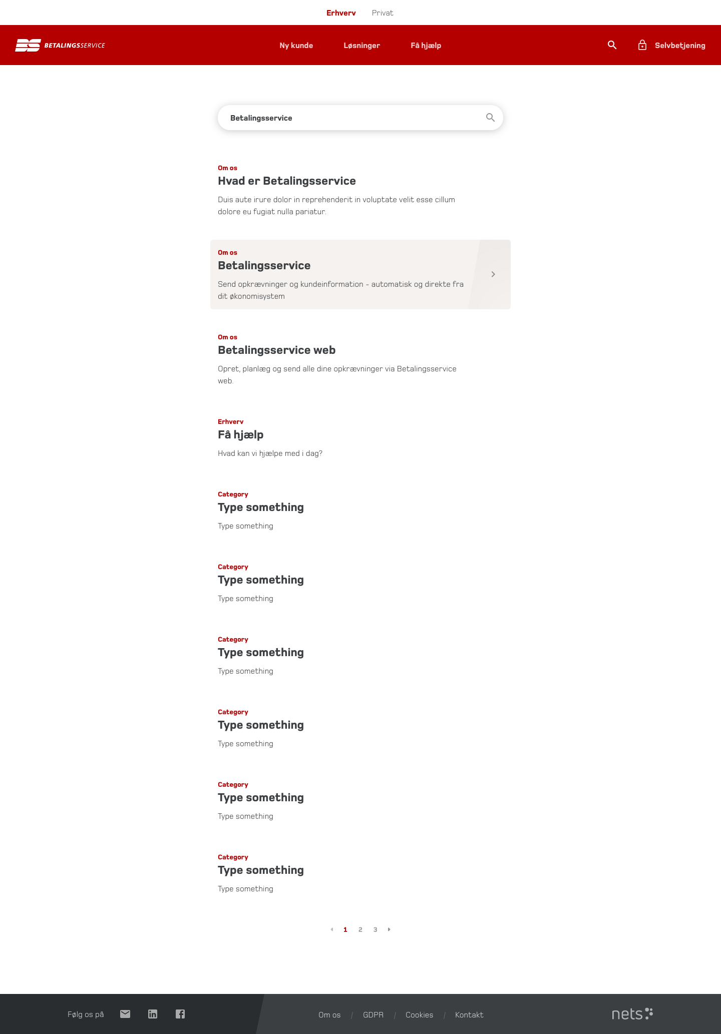
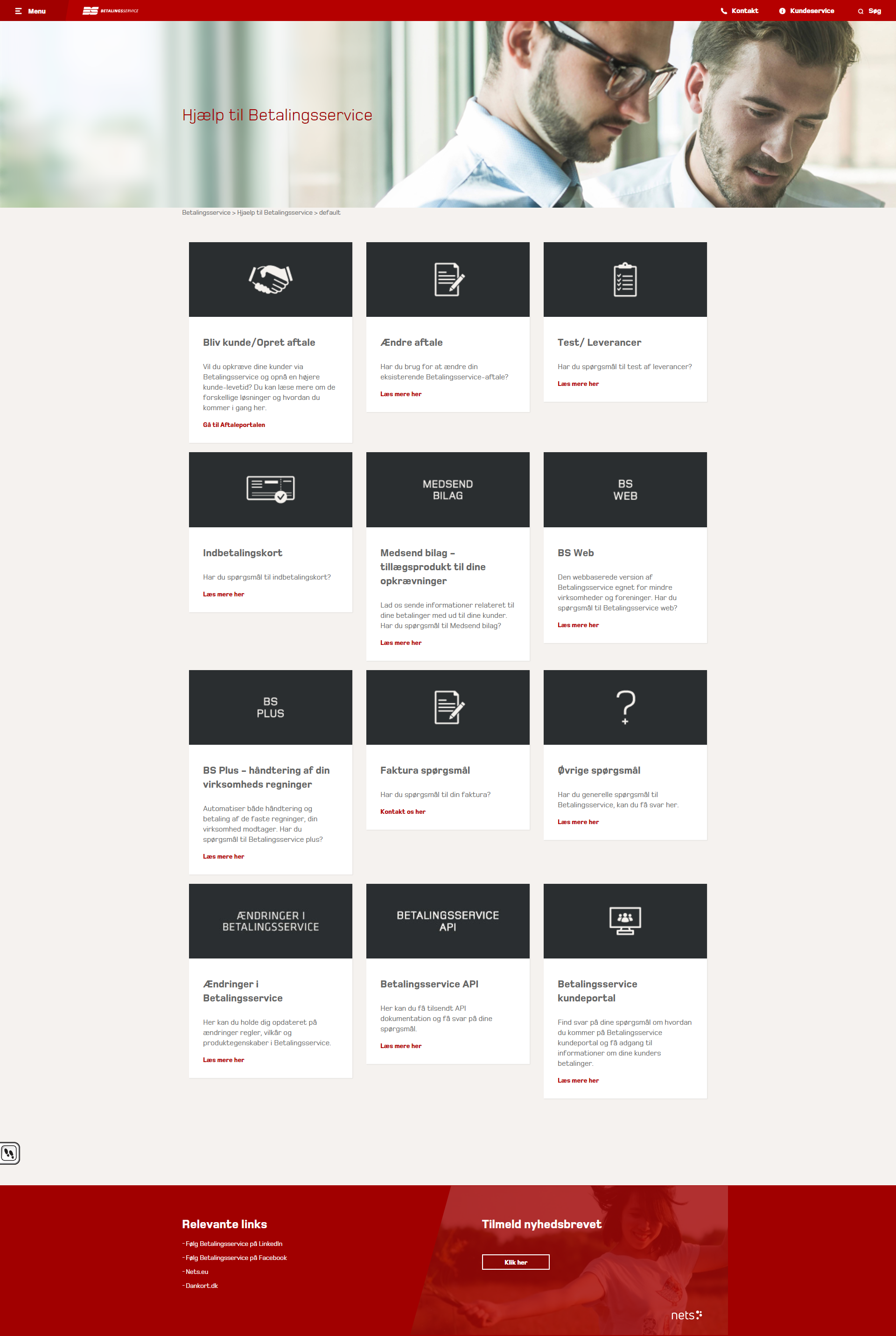
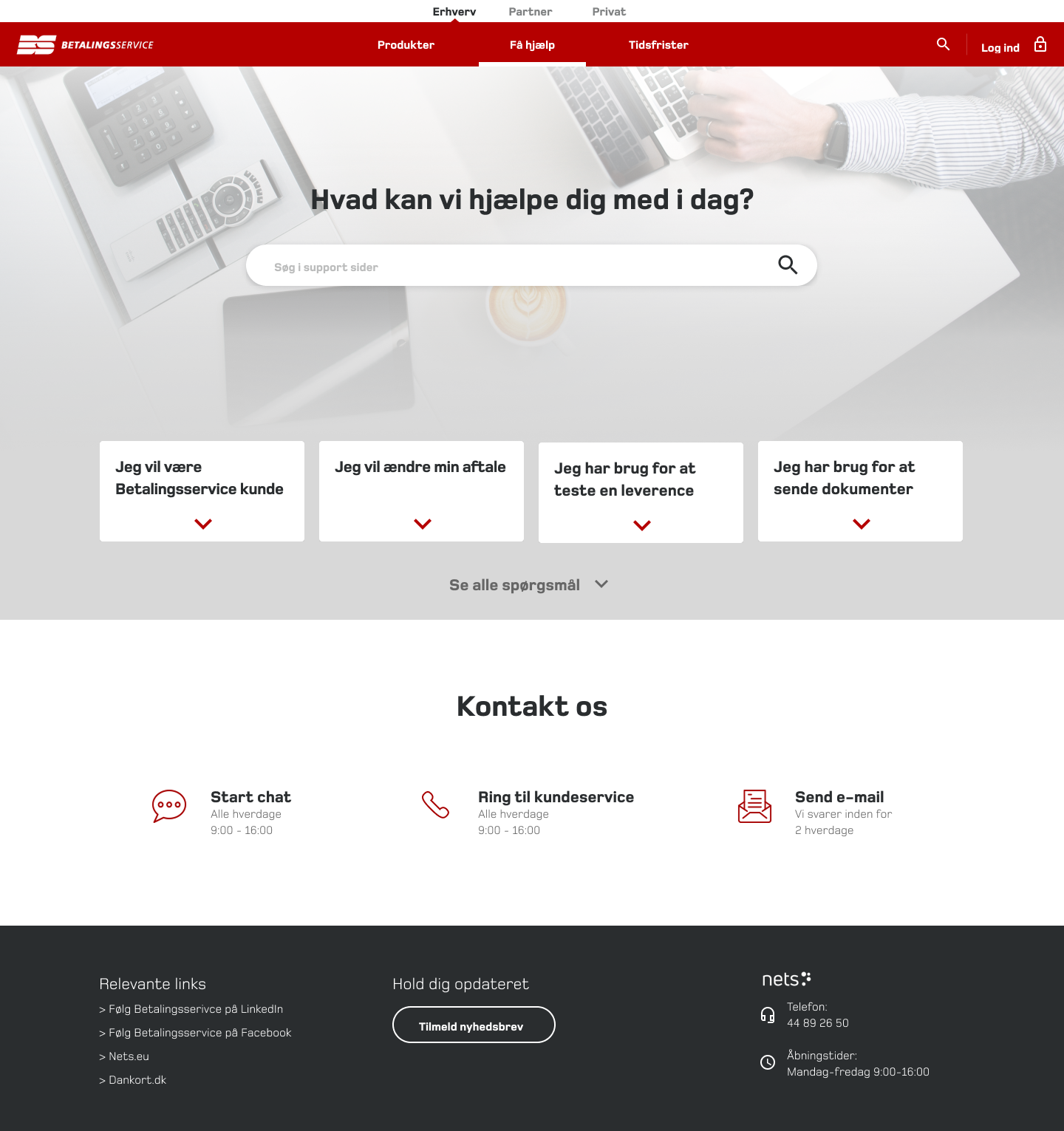
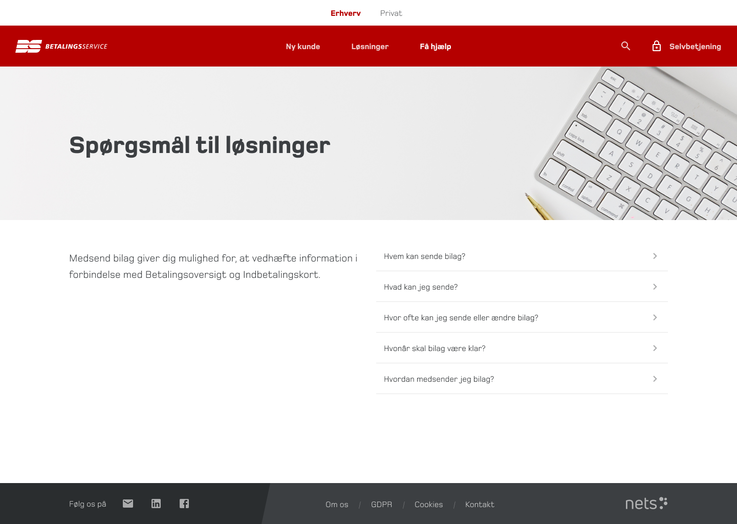
“Help Center” Overhaul
- Developed a content strategy, ensuring consistent structure and scannability.
- Redesigned key support pages, like “Change Account Details” and “Send Documents.”

Impact
The new pages accelerated onboarding, reduced support calls, and improved self-service success rates.
Phase 4
Implementation & Developer Collaboration
Since the site was built in SharePoint, I collaborated closely with an external development team to ensure smooth execution.
- Visited developers on-site to understand technical constraints.
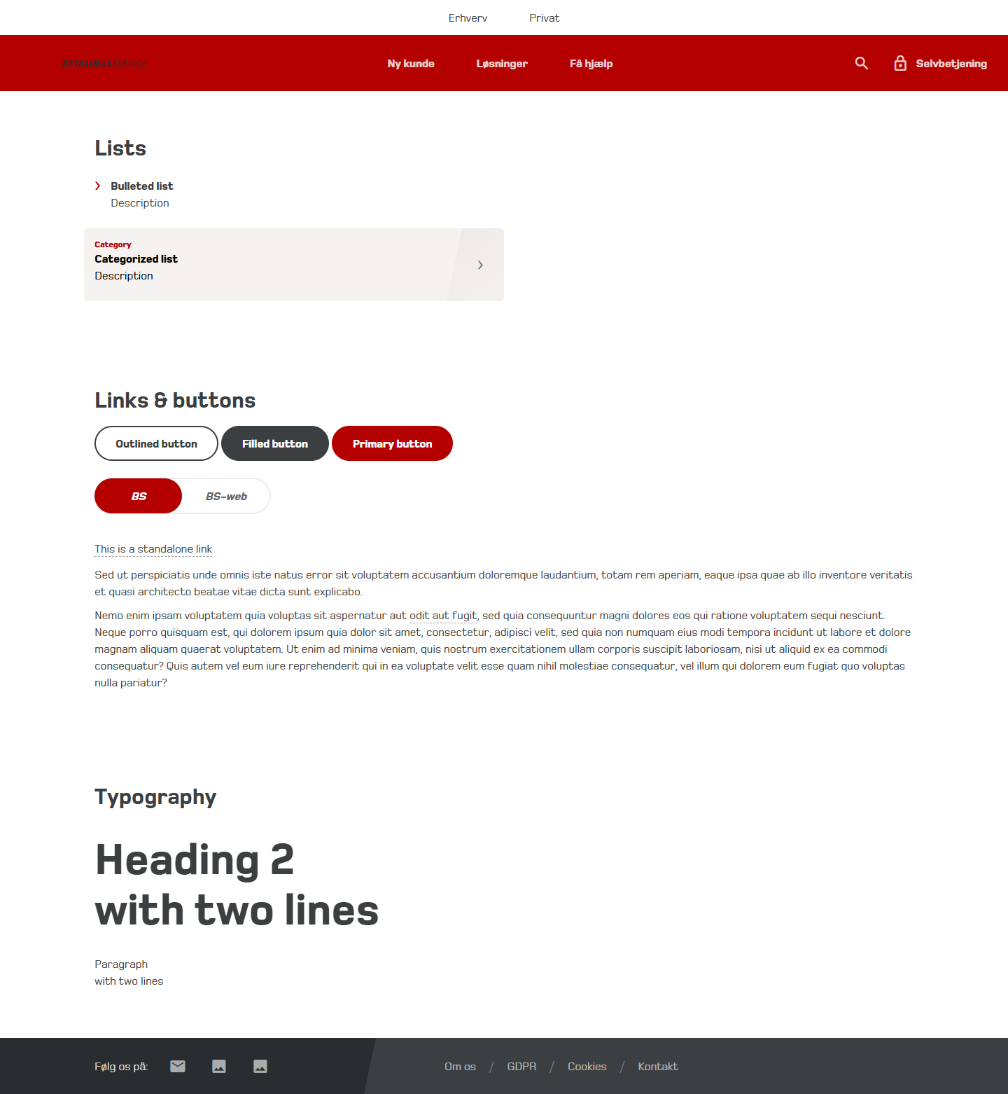
- Created an HTML & CSS template, proving that my designs were feasible.
- Used developer-friendly file naming conventions, ensuring a smooth handoff.
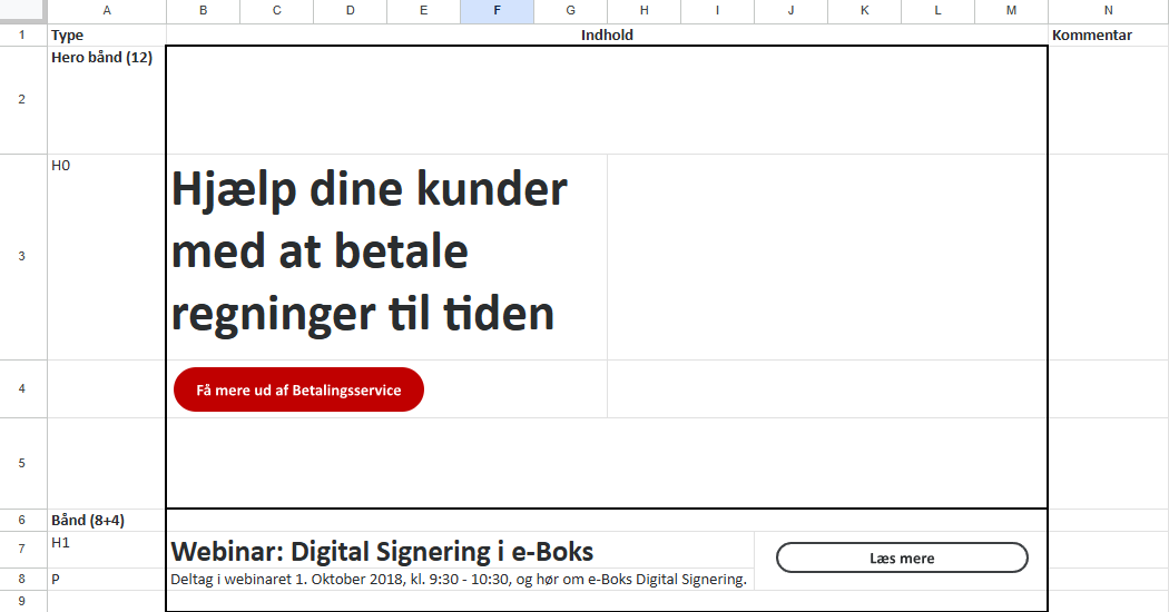
- Visualized module placements in Excel, making it easier for the marketing team to manage content.
Impact
Developers could implement designs faster and more accurately, reducing iteration loops.
The Results
A 55% Increase in Usability
In June 2019, a post-launch user research study revealed a dramatic improvement in customer experience.
CEB Score increased from 38% to 59% – a 55% improvement in ease of use.
Reduction in customer service inquiries as users could now self-serve effectively.
Faster onboarding for new customers, leading to better retention and fewer drop-offs.
User Feedback Highlights
✅
Navigation is intuitive and clear.
✅
Finding deadlines for payments is easier.
✅
“New Customer” and “Solutions” pages are highly useful.
✅
Self-service options are better structured.
“
That’s actually smart, maybe we should look a little more at this page… there are actually a lot of good things on it that I could imagine we could benefit from.
Dorthe
Consulting engineers
“
There are actually a lot of answers to questions including the various sub-points, and there are actually more than I expected when I clicked on the page.
Anna
Administration
“
Here under “New customer” there are some really good options to find the right solution.
Anders
Telecom
Areas for Further Optimization
- Some users still struggled to locate specific help topics.
- More subheadings needed in the “Help Center” for better clarity.
Key Takeaways
- A structured approach to information architecture is critical in FinTech UX.
- Early collaboration with developers prevents implementation roadblocks.
- User testing is essential for validating assumptions and refining usability.
Final Thoughts
This project transformed Betalingsservice.dk from a frustrating, complex platform into a structured, user-friendly experience, improving navigation, self-service, and onboarding.
