Designing a Pan-European Portal That Almost Was
How I led a cross-market design transformation – unifying two merchant platforms, bridging product and UX leadership, and mentoring a team toward an intuitive, scalable solution… only to see it shelved after a corporate shake-up.
⚠️ Note: This case study is currently being updated. Visuals and final design assets will be added as soon as they become available. In the meantime, feel free to explore the process and outcomes.
Quick Summary
Designing a Unified Merchant Portal for 7 Countries
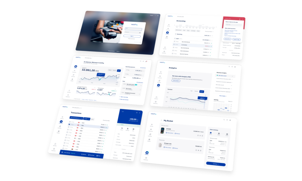
From 2019 to 2021, I led the design of a new merchant portal for Nets and Concardis, aiming to merge their platforms into a seamless experience across the Nordics and DACH region. I combined product thinking, UX leadership, and team mentoring to build a future-facing solution—resulting in strong usability test scores (CES 8.0, NPS 48, CSAT 8.8). The project inspired a broader service design initiative before being shelved post-acquisition.
Role
Lead UI/UX Designer
Tools
Figma, Preely, AfterEffects
Team
Designers, Product Managers, Tech Leads
Timeline
2019 – 2021
(2 years on-off)
Setting the Scene
A Merger of Markets and Mindsets
In 2019, Nets acquired Concardis, expanding from a Nordic/Baltic focus to now include the DACH region. This merger created an opportunity – and a challenge – to unify two very different merchant portals into one consistent experience: the Nordic “MyNets Portal” and the German “Smartpay Portal”.
At the time, I had just wrapped up work improving the user experience of Betalingsservice’s website and transitioned to MyNets 2.0, which was still in active development. I had worked primarily on the transactions and settlement flows but gradually became involved in broader parts of the portal. That knowledge, plus my experience driving the Figma transition at Nets, led to me being appointed lead designer on the new unified portal.
The Goal
One Portal to Rule Them All
Our mission: Create a scalable, intuitive portal for merchants across seven countries.
Key goals:
- Reduce internal cost by consolidating platforms
- Improve usability and self-service
- Harmonize experience across regions, languages, and markets
Although paired with two Product Managers, the primary PM went on extended sick leave—and never returned. I stepped in to fill the gap: structuring backlogs, setting up stakeholder meetings, coordinating feedback loops, and driving the project forward without an official PM in place.
We had a growing list of requirements from both PM and user research—some aligned, many not. My first job was to bring clarity.
Clarifying Needs
Architecting the Experience
Building Scalable Guides
Delegation and Mentorship
Bridging UX, Product & Tech
Testing the Vision
Phase 1
Clarifying Needs with Data-Driven Prioritization
I consolidated requirements from stakeholders and cross-referenced them with analytics, user feedback, and internal survey data. I built a matrix to assess feature relevance, based on:
- GA data (e.g. 70% of users filtered transactions)
- Survey responses (e.g. 78% downloaded settlement reports for their accountant)
- NPS feedback (Accounting: 39% most valuable feature, Transactions: 27%)
Personas were frowned upon in our team, so instead I mapped user mindsets and workflows—distinguishing between accountants, business admins, and employees—and used these behavioral segmentations to drive our IA and role-based design.
We also did several internal usability tests to validate interactions—such as how users preferred to select items in tables, and how to best visualize data loading states.
Phase 2
Architecting the Experience
We developed a clear navigation split between dynamic data (Overview, Transactions, Accounting, Analytics) and administrative tools (My Business, Nets Store). This structure reflected how users mentally sorted their tasks and mirrored both physical and business hierarchies.
Supporting this IA, I helped define user flows and system relationships (e.g. how sales locations tied to agreements and terminals). This was vital for role-based access and clarity.
Phase 3
Building a Scalable Design System
With Figma as our central tool, I led the creation of a modular design system based on an adapted version of Atomic Design. Together, the team and I created:
- Vision statements tied to brand, product, and experience principles
- Consistent naming conventions (e.g. “Shops” instead of “Sales Locations”)
- Rules for iconography, touch targets, states (hover, disabled, pressed), and responsive behavior
- Style guides and UI patterns for desktop, tablet, and mobile
Everything was documented—from agreed decisions to open questions and screen-specific design gaps (like empty states).
Phase 4
Delegation and Mentorship
I distributed work based on strengths:
- I took ownership of Sign In, Transactions, and Accounting
- One designer focused on My Business, Global Search, Support Center, and Administration
- The junior designer I mentored worked on Account Settings, Notifications, and the Dashboard and Nets Store
- A fourth designer handled Analytics
We held retrospectives every two weeks, which fostered transparency, reflection, and process improvement.
Phase 5
Bridging UX, Product, and Tech
We used demo sessions not just to present, but to provoke discussion—connecting architecture, product, and UX. I often facilitated these, helping stakeholders weigh trade-offs, from batch transaction logic to notification strategies.
We also produced a teaser video showcasing our progress, which reignited internal engagement at a time when momentum was fading. This presentation helped spawn a larger initiative led by a service designer and graphic designer, who took our UI and envisioned a full customer journey—from buying a terminal to unboxing, onboarding, troubleshooting, and growing one’s business.
Their concept included packaging design, a companion app, and a new onboarding flow. It too was made into a vision video—and was also ultimately paused. The service designer left Nets not long after.
Phase 6
Testing the Vision with Real Users
Using Preely, we ran two rounds of usability tests with merchants. Feedback was overwhelmingly positive:
CES
8.0
0 to 10
NPS
48
-100 to 100
CSAT
8.8
0 to 10
User quotes included:
“
Super intuitive
“
Easy to use and supportive
“
Peace of cake
“
Much better than the current one
The Results
Momentum Meets a Wall
In early 2021, Nets was acquired by Nexi. Priorities changed overnight.
Our project was paused. Resources were moved to rebrand existing portals with Nexi’s colors and logos. One by one, the team disappeared: contractors reassigned, internal designers quit or were laid off. A new Lead Designer was brought in to lead the combined portal—but chose not to use the design work we had produced.
After more than two years of effort, alignment, and passion, our work was quietly shelved.
I left Nets not long after.
What I Learned
What I Learned – Design Leadership in the Grey Zone
This project taught me to lead without authority, to structure chaos, and to inspire progress even when direction is unclear. I learned to balance business goals with user needs, and to create clarity for others—even when I didn’t have it myself.
It was a crash course in cross-market design, stakeholder alignment, and platform unification. And yes—it broke my heart a little. But it shaped me more than any polished success story ever could.